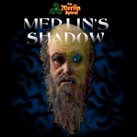
Updated Book Cover For Merlin’s Shadow
Based on the comments I received on my personal cover art for Merlin’s Shadow (THANKS EVERYONE!) I changed the image.
Yes, the previous image had too much horror in it. I hope the new one does not.

Comments are greatly appreciated on this new image. Does it still contain too much horror?
Thanks!
-Robert

I don’t think it’s too much horror. I like the eye that’s gone.
Since your book might fall under the “fantasy” category, my only concern would be that it doesn’t have that traditional “painted scene” on the cover, like Robert Jordon’s Wheel of Time series has.
If you want to draw in the fantasy crowd, that route might be stronger?? But I could be wrong!
Brandon,
Thanks for commenting! You’re right that it doesn’t have that traditional fantasy look for a cover, but its only my own image for use until I find a publisher.
Either way, I’ll be giving strong input to an artist and so my thoughts at this stage will help when that time comes.
Here’s a fun thing … cover the guy’s face so you only see one side at a time. The contrast is pretty stark.
Also, it’s interesting you thought the eye was gone. I was trying to make it appear to glow. Back to the drawing board (if I can find the time!)
-Robert
Hey Robert,
I see, so it’s a temporary cover until you can land a publisher.
I do think it looks good. And I really like the “Merlin’s Spiral” graphic. Very sharp.
Its all just part of promoting my work and making my blog as professional as I can.
My main concern was giving the wrong impression about my writing.
Thanks for your input, Brandon!