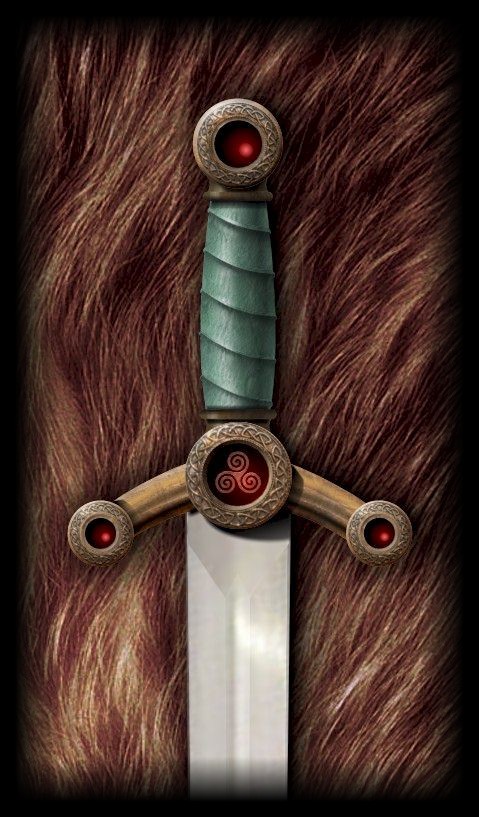
New Excalibur Art For Merlin’s Blade
Okay, so I admit it … I have been dissatisfied with the current design and quality of my version of Excalibur … so I redid it.
Not only did I change the funky bolt-shaped hilt end pieces to circles (which is more authentic), but I took a cue from my son’s 3D art and used actual textures, including leather and bronze.
So here it is. Although it isn’t completely photo-realistic, it is definitely a lot better than the previous version.

(I will be updating the website soon to use this version.)

That’s so cool! I really like the changes… makes it look more realistic and authentic. very good. *thumbs up*
Thanks, Nichole! Maybe I can get Leighton to do it in proper 3D … hmmmm!
Yeah, it’s great! Very cool =)
Also, I forgot to mention–thanks so much for answering my questions awhile back. It’s always interesting to get an inside look at other authors’ processes!
Best,
D. S. Dahnim
Thanks, D.S.! And you’re welcome for the answers to your questions … if you have anymore, just let me know.